Context: I used to follow Neville Medhora’s work for a long time. He sells his uber famous Copywriting Course at copywritingcourse.com and I wanted to figure out a way to work with him so one day I decided to write him an email. Below is the copy I used for the cold mail.
Subject: You’re the best KopyWriter alive!
Body:
I mean it, Neville.
You are one of the finest writers alive when it comes to writing stuff that sells.
Out of everyone I know or have heard of, you are the only one who I believe has this superpower to craft amazing stories consistently. Your pal Sam Parr is also really good but he’s not as good as his teacher yet.
BUT there’s a huge problem.
You are difficult to trust.
Now, before you discard this email like last night’s chutney. Let me tell you, this is not just for your attention. There’s substance behind it.
The other day, I was watching your ‘Sales page test’ video on YouTube (I’ve devoured most of them).
This particular video took me to the Copywriting course’s /join (https://web.archive.org/web/20201127171235/https://copywritingcourse.com/join/) page and boy oh boy, the designer inside me almost had a heart attack.
Since you are one of the few people I really admire, I decided I’d help you understand what’s wrong with this page, how you can improve it and redo this page design for you that you can put to use (attached as a link).
So, first thing first.
Before you read this letter any further, I’d really recommend you take a quick look at the /Join page on the copywriting site. (I know I know, it’s your site and you’ve seen the page a gazillion times but trust me, just go to the page and give it a quick look. I’ll wait for you here.)
Now that you’re back (I hope).
Let me tell you something that EVERY memorable brand has in common. Conversely, you could also say that it is one of the features that every brand has to have in order to become great and memorable.
It’s called Standardisation.
If you want a moment to absorb this holy wisdom, you can take it. But it is true.
Every great brand speaks one language and presents itself in one standard way.
But this Join page, it’s like a Standardisation butcher-house. Here’s why.
Let’s begin with headings.
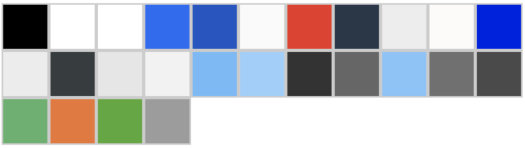
There are 20 headings on the Join page and here’s a break down of the different styles you’ve used.
| Font Family | Sizes (px) | Weight | Styles | Color |
| Roboto, Open Sans, Serif | 40, 48, 56, 64, 80 | 400, 700 | Normal case, Camel case, All caps, thin, underline, colored, colored underline, regular + bold, regular + underline, italic + bold | Green, Black, White, orange |
This is just the beginning but at this point I can bet, Neville. If there were more available html styles, you’d use them.
Similarly, there are over 5 different subheading styles.
8 different font families in use throughout the page. That’s not 8 different font styles but FAMILIES.
No standard color palette.
At least 3 different icon types.

At least 4 different image styles: rounded corners, pointed corners, black and white, almost square, square, circle.
No standard padding or spacing. No standard font sizes or styles.
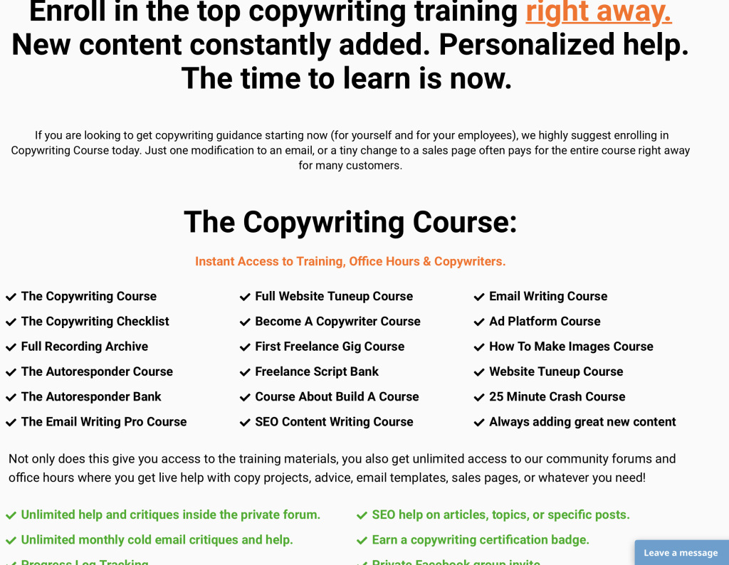
This screen alone has 4 different colors and 4 different font sizes in use.
There are typos and grammar problems. Here’s one:
An entire section missing:

Even the borders used for photos are of three different widths. 1px, 2px and 3px and not in that order.
WHY NEVILLE, WHY!
I can go on and on but I think you got my point.
Hence, the trust issues.
Compare it to Google or Apple. They’d go as far as killing usability to attain standardisation and esthetics.
Here’s an example:
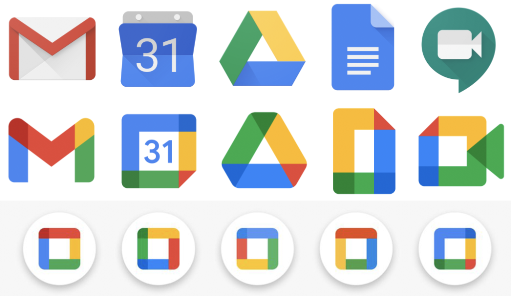
Recently, Google redid their Icons. Here Standardisation > Usability.
The reason they’re trying so hard is to create an easy to distinguish brand. With these new icons, just by looking at one of them I can easily identify it as a Google product.
I don’t recommend pushing it this far but we can make remarkable progress on this front just by restricting ourselves.
Let me show you.
I redid the Join page here. https://heavyroller.com/copywriting-2-0/ (desktop only) (set to noindex)
Just simple standardisation and a little bit of improvement here and there and it now looks like it’s ONE website/brand.
This is a trade that you can leverage to become a quadruple threat. Needless to say, you’d sell a hell of a lot more.
If you think this makes sense, you can go ahead get this replicated on your site or I can share this template with you since we’ve already built it or this brown brother of yours can implement it for you. (I run ZOZUK, a premium WordPress support and maintenance agency, helping the likes of Oxford International Education Group manage their sites.)
Just can’t wait to hear your take on this.
Let’s jump on a quick call if you’re available the coming week.
Happy Thanksgiving!
Sincerely
Aditya Rathore
ZOZUK
PS: I went through your checkout page as well and I believe it can also be drastically improved.
PPS: We redid some images and improved UX of some sections. How many of them can you identify? 🙂
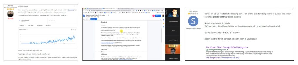
Result
Neville responded to the mail and we went on to design a landing page for Kopywriting Kourse. 🙂